A Container Cafe Designed Around the Queue
Container coffee kiosks usually get designed from the outside in. Someone picks a bold colour, cuts the biggest hatch the wall will allow, hangs a menu board and works out the inside later. Then the first busy morning arrives. Customers who have paid stand in front of people who haven’t ordered, the barista reaches past the cashier for every cup, and the bin bags go out through the same crowd that came for coffee. Every one of those problems comes from the order in which things happen, and a container makes them worse because there’s so little room inside to recover from a bad layout.
This concept starts from the sequence instead. Imagine a two-person takeaway coffee stand on a busy commuter route, with a sharp peak between seven and nine and a long quiet afternoon. A customer arrives, orders, pays, waits, collects and leaves. Behind the hatch, staff take the order, pull the shot, steam the milk, hand the cup over, clean as they go and get rid of the waste. Every one of those steps needs a place. The aim is to keep each one moving in a single direction, to reduce avoidable crossings in the customer area and repeated reaching inside. It is a workflow proposal, not evidence that two people can work at full speed in any equipment layout.
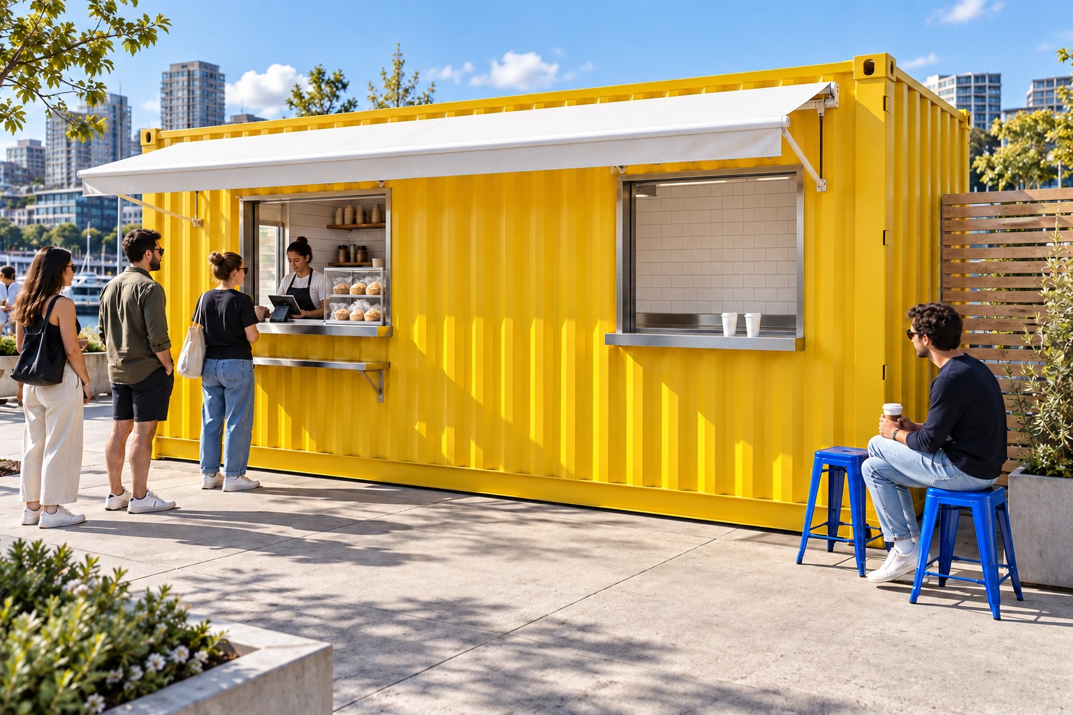
Image credit: pxef.com. AI-generated design concept.
The shell here is a standard 20-foot container, about 5.9 by 2.35 metres inside according to one shipping line’s nominal figures. The proposal reserves roughly 75 millimetres at each lined wall and 150 at the cargo-door end for an inner staff door, plus 60 and 75 for floor and ceiling build-ups. Food-area finishes, moisture control and the actual envelope need specification for the use and climate; these are space-planning allowances, not a hygienic wall assembly. That leaves a finished interior of about 5.67 by 2.20 metres with 2.26 metres of headroom. Across that 2.2 metres the plan fits three strips. A 650 millimetre counter runs along the street-side wall, a 950 millimetre working aisle sits behind it, and a 600 millimetre counter lines the back wall. The total is 2,200 millimetres, which leaves almost nothing spare. A 950-millimetre aisle is a constraint to test, not a universal allowance for two people. Staff bodies, projecting handles, open fridge doors and carrying hot liquids all use it. If the actual equipment and tasks do not fit without awkward passing, the plan needs fewer simultaneous tasks, different equipment or a wider building. Station order helps, but does not manufacture clearance.
Seen from the street, the left end of the container is where people order. A 1,000 millimetre hatch frames the till and a small case of packaged pastries. The intended queue forms in an allocated waiting area to the left, parallel to the building, so the line can grow away from pickup while leaving the public pedestrian route open. Whether there is room for that arrangement is a site question, not permission to occupy a pavement. To the right of the order hatch, the wall stays solid for nearly two metres. Behind that solid section, on the inside, sit the espresso machine and grinders, facing the barista. Then comes a second, narrower hatch for pickup, with a ledge for cups and a shelf outside for lids and sugar. Customers who have paid drift right to wait, collect at the second hatch and carry on along the footpath. The flow runs left to right, start to finish, which gives ordering and waiting distinct destinations. A busy morning still needs observation and adjustment; customers do not move like arrows on a drawing.
Splitting order and pickup into two hatches is the core decision, and it has a cost. A single long opening looks more generous and shows off the machine, which some coffee businesses consider part of the product. It can also invite the classic muddle, with everyone gathered at one window and no way to tell who is waiting for what. The proposal uses separation as a design hypothesis: give an arriving customer one clear place to go and a paid customer another. It does not claim a measured reduction in service time. Leaving a solid wall between smaller openings also avoids assuming that almost the entire side can be removed, but it does not establish structural adequacy. The openings and any reinforcement still require project-specific design.
Inside, the stations follow the same left-to-right order. The order station holds the till, cups and packaged items that the cashier uses most. The barista owns the middle, with the machine, grinders and knock box in front and an under-counter milk fridge directly behind on the back wall, one half-turn away. Handing over the cup means a step or two to the right to the pickup hatch. The aim is to keep routine supplies with the person using them, with replenishment planned outside the peak rather than assuming neither worker ever moves. Along the back wall, after the fridge, sit space reserved for equipment washing, water treatment and a dedicated handwash basin near the working stations. The actual washing arrangement, hot-water provision, splash separation and access need review against the menu and local food requirements before this counter can be considered fully specified. Bins live under the back counter at the right-hand end, next to the staff door in the original cargo-door end. The service-side route is intended to let staff remove waste without carrying it through the queue. Storage, collection and cleaning arrangements still need to fit that yard, and the staff exit must remain clear.
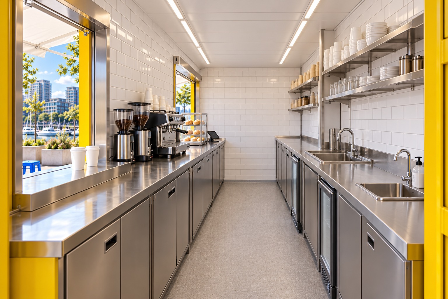
Image credit: pxef.com. AI-generated design concept.
The handwash basin deserves more than a passing mention. It needs to be conveniently usable during service, rather than hidden behind stock or treated as a place to rinse coffee equipment. A separate washing task needs its own suitable arrangement. Showing two basins in an illustration does not settle the number, size or type of facilities required for a real menu: the relevant food authority may require additional compartments, a dishwasher, other sinks or a different layout. This is why the proposal reserves functions first and leaves the final equipment schedule to review, rather than pretending that every stainless rectangle is interchangeable.
The menu decides the equipment, and the equipment decides almost everything else. This concept sells espresso drinks, filter coffee and packaged pastries. That’s a deliberately narrow menu. Choose the actual espresso machine before finalizing counter depth and services. Its footprint, clearances, weight, electrical rating, water treatment and drainage requirements belong on the equipment schedule, together with the grinders, fridge and washing equipment. A generic two-group machine in a generated image cannot supply those specifications. Add smoothies and the plan acquires a blender, ingredients, cleaning work and more noise. Add toasted food and heat, ventilation and fire considerations may change. Iced drinks introduce cold storage, ice handling and cleaning questions. A short menu earns its place by keeping both the workflow and the equipment brief manageable. Each extra item reaches back into the building.
Water and waste are the quiet questions. A permanent site may offer suitable potable-water and drainage connections; a temporary pitch may require approved alternatives. Neither can be assumed from a paved patch beside a road. The designer needs the equipment schedule, expected use and local requirements before choosing supply, hot-water provision, drainage or any tank capacity. Site connections can be a substantial part of the scope and should be priced explicitly, alongside delivery and fit-out, rather than disappearing behind the headline price of a container.
Outside, the customer side needs as much thought as the inside. An awning over both hatches offers some shelter, though wind-driven rain and a queue extending beyond it need their own thought. A row of blue stools sits near the pickup hatch for people who want to wait seated, placed so they don’t spill into the line. Height is the hidden problem. A container sitting on supports lifts its floor well above the pavement, so a counter at a comfortable height for staff inside can end up chest-high for customers outside, and out of reach for someone in a wheelchair. A lower ledge by itself does not solve that relationship. Customers must be able to order, communicate, pay and receive the drink at a usable service point, with the required approach space and route. The concept includes a lower external shelf as a starting idea, but its height, length, reach to the terminal and actual handover arrangement need to be designed together. A platform is not an automatic solution either: its approach, gradients, landings, edges and effect on the public route would need checking. Accessibility belongs in the first site layout, not as an attachment after the hatch is cut.
Everything above is a design scenario. Before commissioning the conversion, establish the local requirements for food-business registration, premises review, trading at the proposed pitch, land use and building work. These are separate questions, and registration does not by itself approve a layout or the right to occupy a public footpath. The relevant food safety and planning contacts should see the menu, proposed equipment and site arrangement early, while it is still cheap to move a sink or change the serving side.
Is a container the right building for this? Compared with a kiosk built to a chosen footprint, its fixed width and new service penetrations constrain the layout, and the hatches have to be negotiated with a steel shell. The reusable steel shell can be appealing to an operator testing a pitch, but finished security depends on the hatches, doors and locks. Relocation depends on the conversion, lifting access, service disconnection and transport costs. Those benefits need checking against a purpose-built kiosk rather than taking them on trust. If the queue works, the box works. If the queue doesn’t, no colour will save it.